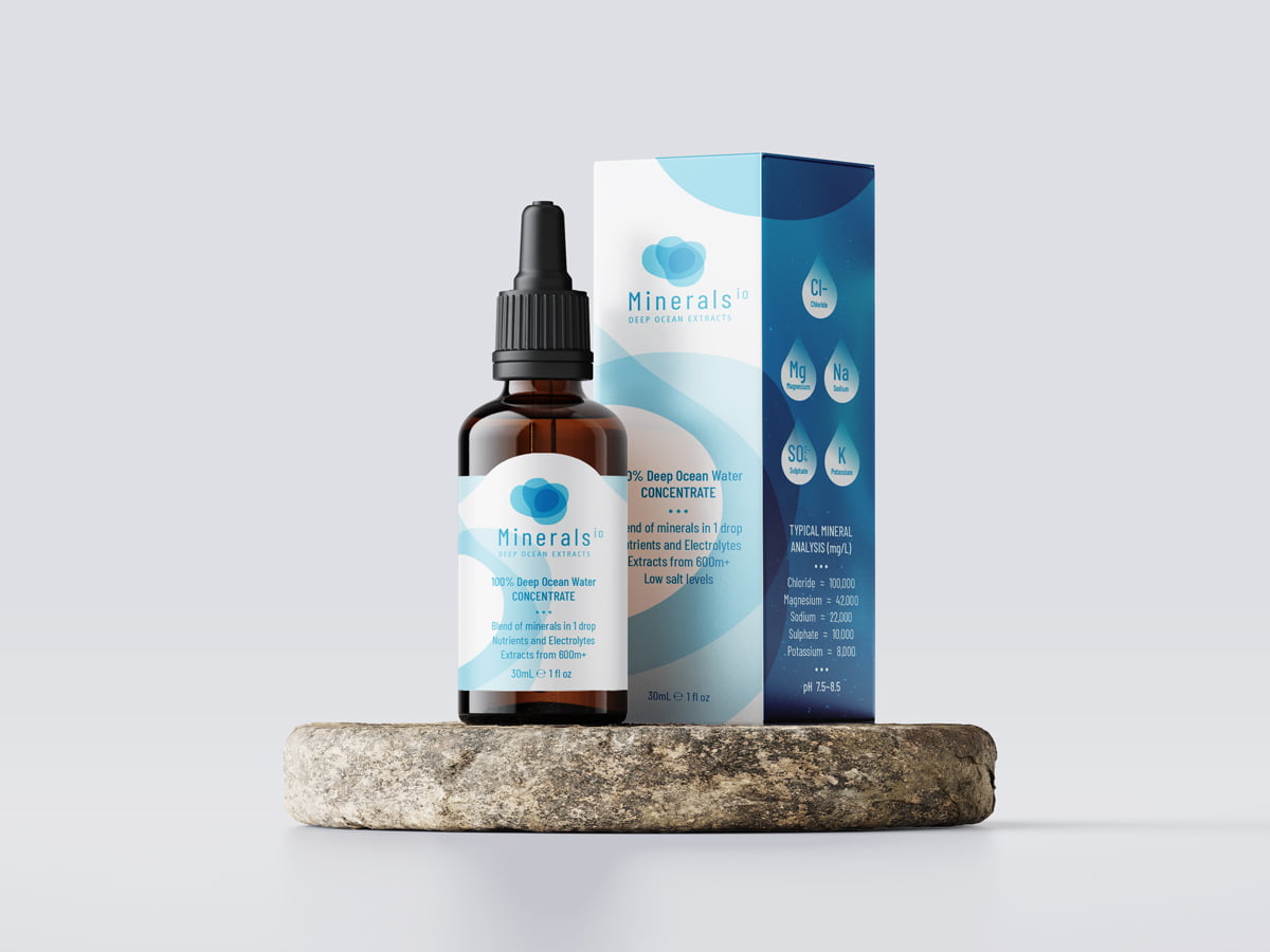
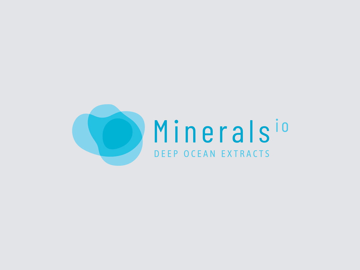
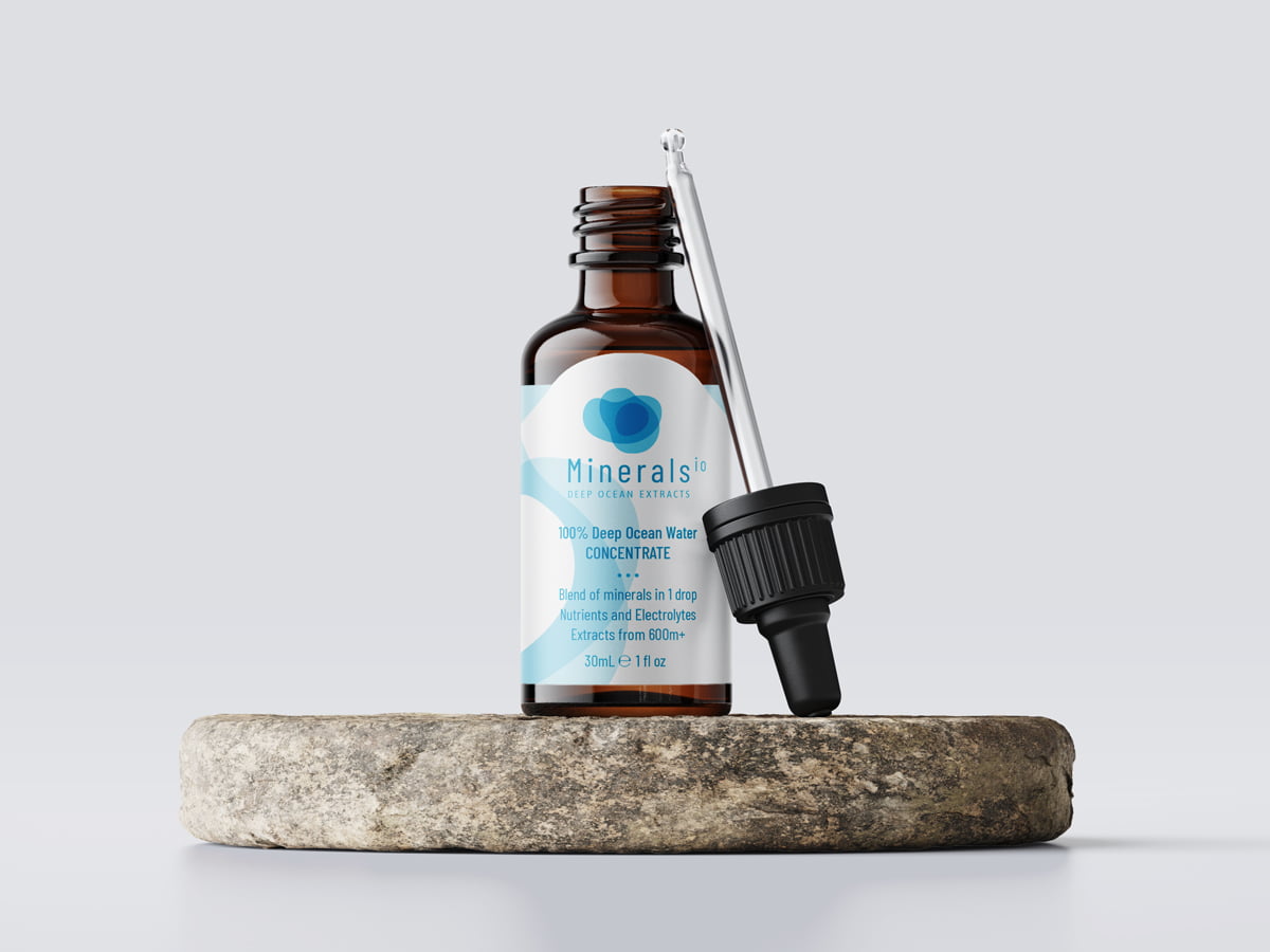
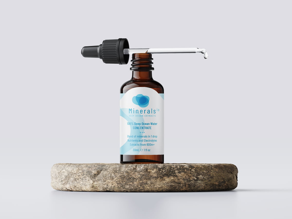
Fresco Creative was asked to create a logo and packaging design for Minerals io, a new product being imported into Australia containing concentrated minerals sourced from unpolluted, deep water locations. We created a logo design that visually represented the product and translated that across to the packaging – a box and label of a dropper.
“This logo explores the idea of ‘depth’. The icons are made up of organic shapes that are layered one on top of the other to create darker and darker sections where the colours overlap – we call this multiplied colour. The icon symbolises deep ocean abysses and diving chimneys and uses a clear blue colour to represent purity. We have paired the icon with the typeface Barlow Condensed which is a contemporary sans serif font that is suitable for food, vitamins and supplements. Again the ‘io’ has been made into a superscript so the word ‘Minerals’ is most prominent. The packaging would stem from this idea of ‘depth’ – we suggest using images of deep oceans with tiny dots visible (to represent minerals/nutrients). We have placed a graphic shape over the top of the imagery quite large to tie in the box with the logo and to emphasise themes of depth. Again, we have added key selling points to the front panel.”
