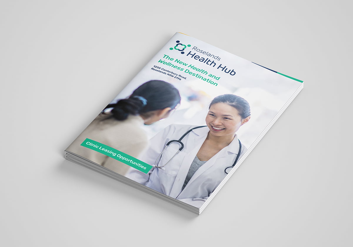
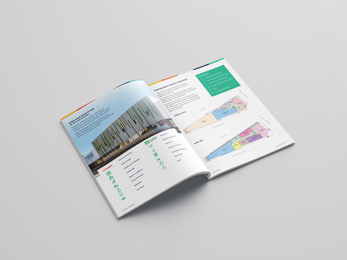
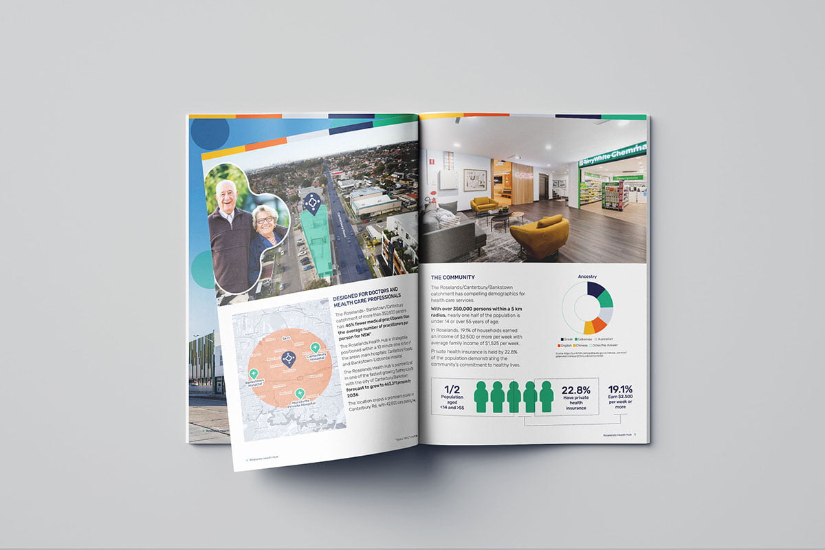
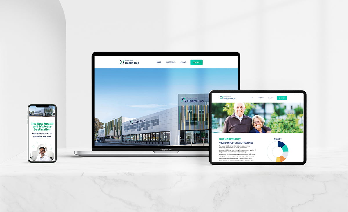
Roselands Health Hub is a purpose-built health and wellness services destination designed to meet the comprehensive health and wellness needs of the Western Sydney suburbs and surrounds. The founder of this development approached Fresco to create a brand identity that reflected and spoke to the multicultural and diverse Roseland’s demographic and attract potential medical and health practitioners to take up residency in the 1,778sqm facility. This identity then needed to be rolled out across print collateral, external and internal signage and digital platforms. Fresco’s design team communicated a community coming together to support and heal through a unique icon that represented four people holding hands, showing support and community and the idea of a healing “hub”. The icons closed, complete shape communicated the idea of being nurtured and of a holistic services as all the pieces are a part of a whole. This can also be seen as a variation of a healthcare cross. The assets from this logo brand were then employed to create a dynamic, engaging and informative website that operated as both a tool to attract potential tenants as well as inform the community looking for a hub of health services.